
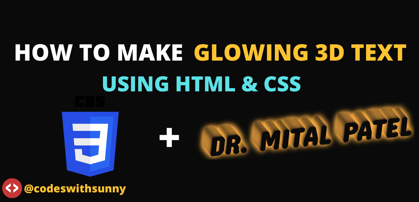
Glowing 3D Text Using Html and Css.
- To make a glowing text-shadow, we will using HTML to create the structure and CSS for the styling of the text.
- With the help of CSS, we can add shadow to text.
- The 3D text GLOWING AND ANIMATION EFFECT is designed by text-shadow property.
- HTML and CSS Code using no using JAVASCRIPT
Here Html Code
 <!DOCTYPE html>
 <html>
 <head>
   <link rel="stylesheet" href="example.css">
 <title></title>
 </head>
 <body>
 <figure>
 Put Here Your Text
 </figure>
 </body>
 </html>
Final Code is Here..........
3d.html
 <!DOCTYPE html>
 <html>
 <head>
   <link rel="stylesheet" href="3d.css">
 <title></title>
 </head>
 <body>
 <figure>
   <h1>Dr. Mital Patel</h1>
   <h1>Dr. Mital Patel</h1>
   <h1>Dr. Mital Patel</h1>
   <h1>Dr. Mital Patel</h1>
   <h1>Dr. Mital Patel</h1>
   <h1>Dr. Mital Patel</h1>
   <h1>Dr. Mital Patel</h1>
   <h1>Dr. Mital Patel</h1>
   <h1>Dr. Mital Patel</h1>
   <h1>Dr. Mital Patel</h1>
 </figure>
 </body>
 </html>
3d.css
@import url(https://fonts.googleapis.com/css?family=Concert+One);

 h1 {
   animation:glows 10s ease-in-out infinite;
 }

 * { box-sizing:border-box; }

 body {
   background:#0a0a0a;
   overflow:hidden;
   text-align:center;
 }

 figure {
   animation:wobble 5s ease-in-out infinite;
   transform-origin:center center;
   transform-style:preserve-3d;
 }

 @keyframes wobble {
   0%,100%{ transform:rotate3d(1,1,0,40deg); }
   25%{ transform:rotate3d(-1,1,0,40deg); }
   50%{ transform:rotate3d(-1,-1,0,40deg); }
   75%{ transform:rotate3d(1,-1,0,40deg); }
 }

 h1 {
   display:block;
   width:100%;
   padding:40px;
   line-height:1.5;
   font:900 8em 'Concert One', sans-serif;
   text-transform:uppercase;
   position:absolute;
   color:#0a0a0a;
 }

 @keyframes glows {
   0%,100%{ text-shadow:0 0 30px pink; }
   25%{ text-shadow:0 0 30px orange; }
   50%{ text-shadow:0 0 30px forestgreen; }
   75%{ text-shadow:0 0 30px cyan; }
 }

 h1:nth-child(2){ transform:translateZ(10px); }
 h1:nth-child(3){ transform:translateZ(20px);}
 h1:nth-child(4){ transform:translateZ(30px); }
 h1:nth-child(5){ transform:translateZ(40px); }
 h1:nth-child(6){ transform:translateZ(50px); }
 h1:nth-child(7){ transform:translateZ(60px); }
 h1:nth-child(8){ transform:translateZ(70px); }
 h1:nth-child(9){ transform:translateZ(80px); }
 h1:nth-child(10){ transform:translateZ(90px); }
OUTPUT


 Posts
Posts


.png)
0 Comments
Please Do Not Comments Any Span Or Span link..